Products, Services, Revenue, and Key Personalities – the heart of every Business. Popular brands like Coca-Cola, Starbucks, Apple, and Microsoft enjoy a great deal of brand trust and have established a global foothold. A part of their success also comes from their stellar branding. Let’s dive into some of the famous brands and how their logos have evolved over the years.
Starbucks
Starbucks Coffee, Tea, and Spice to Starbucks- the journey has been overwhelming and the logo has been evolving ever since. The very first design was displayed in 1971 – a mythical two-tail mermaid – or siren inside of a circular ring in a coffee brown color palette (brown palettes are thought to stimulate appetite) encircled by the coffee shop’s name. In 1987 the color changed to Kelly green – signifying a fresh new start, growth, and prosperity. Starbucks Coffee was also word marked with two stars- adding a new way to connect the logo with the company. The iconic siren became the main focus in 1992 – cropped, updated, and repositioned – making the logo much more aesthetic, and finally, the strips were omitted in 2011, liberating the siren- of’ course with adjustments made by the day.
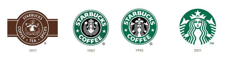
Source: Medium
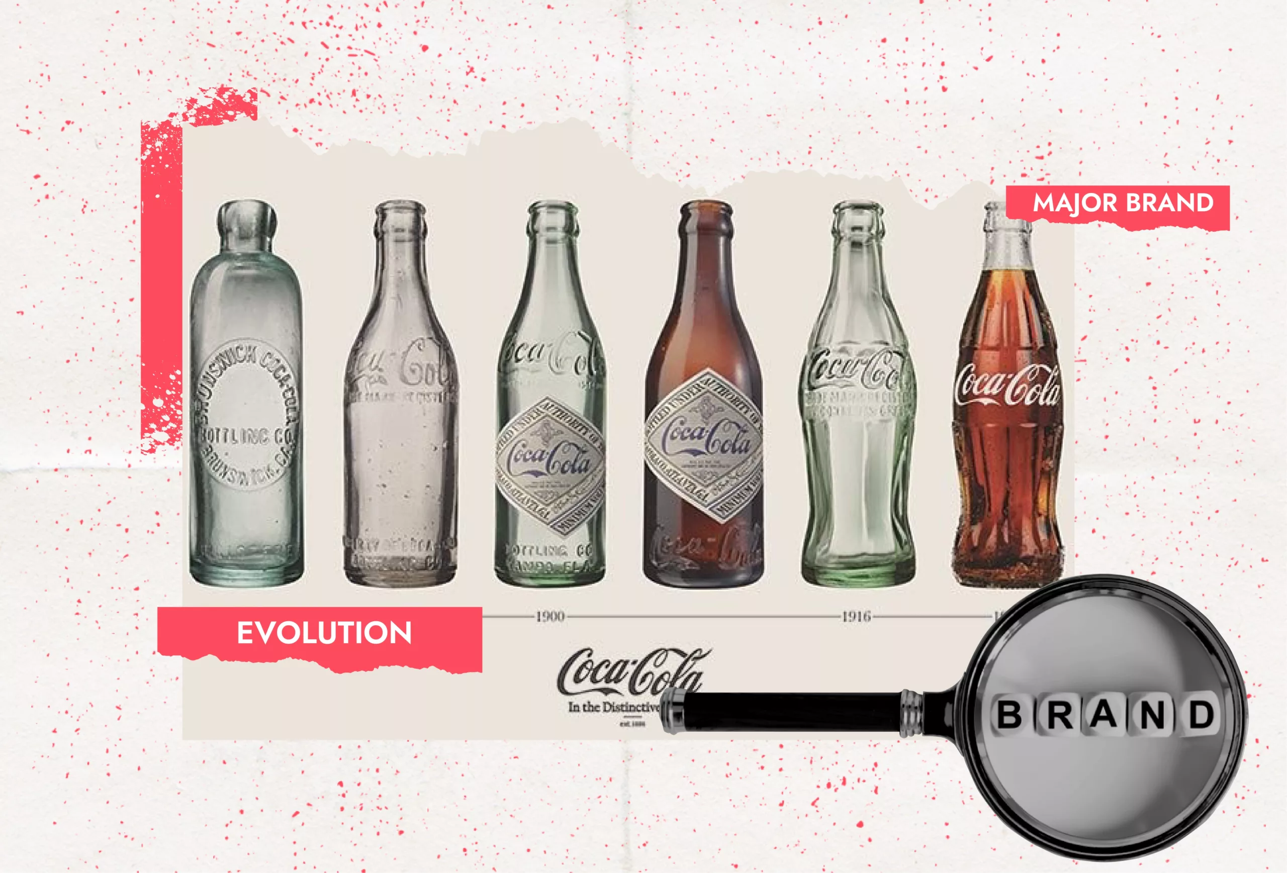
Coca Cola
The refreshing drink that complements a fancy pizza, a giant burger, and even your depressed mood (maybe), also has a long history – in terms of its iconic logo. ‘What’s in a name?’ – Dr. John S Pemberton nailed the formula, and his bookkeeper came up with the name. “The 2 Cs would look well in advertising”- said Frank M Robinson- and went on to design the world-famous logo. Thereafter several changes were made- as shown below.
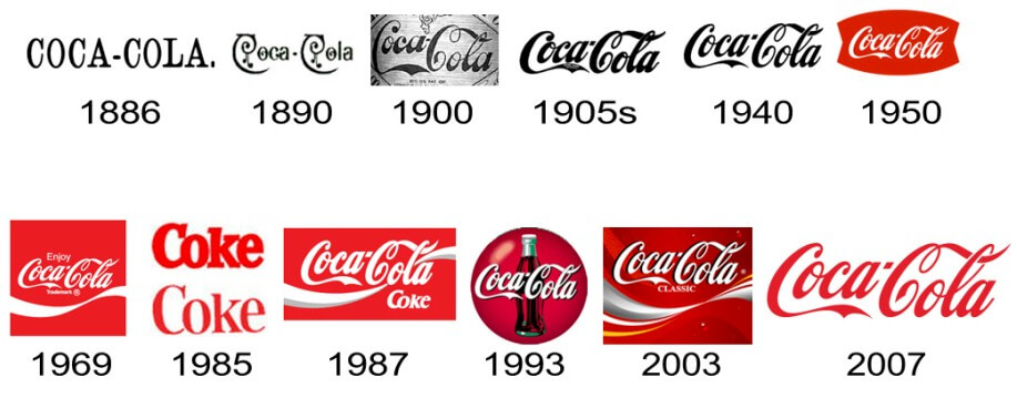
Source: LogoMyWay
Visa
The card was launched in 1958 by the Bank of America under the name BankAmericard – and the original logo was introduced. The brand continued with the same string of colors and fonts – and still looks modern and edgy. In 2005 the logo witnessed the elimination of the rectangular badge – and the wordmark ‘VISA’ got momentum – adding the yellow color to the sharp triangle on the letter ‘V’. the redesign of 2014 brought forward a dark gradient blue lettering, with added style and creativity- making the brand look more exquisite and sleeker.
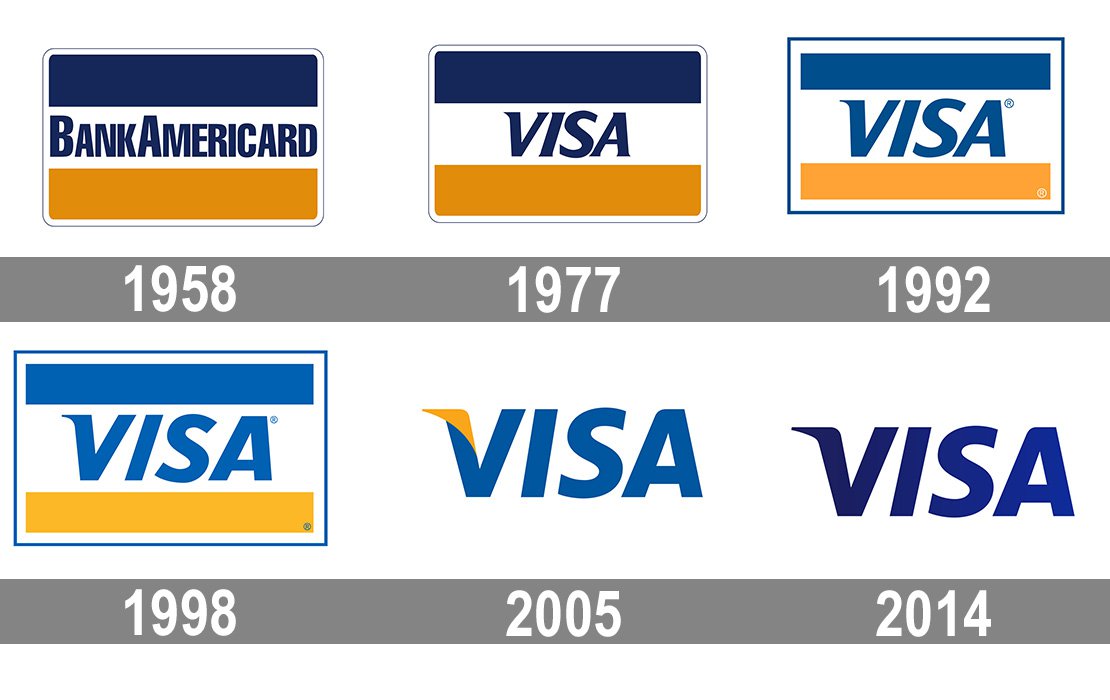
Source: 1000 Logos
Burger King
‘Home of the Whopper’ – Burger King’s tasty food and amazing services gave immense popularity to the brand, and the iconic logo (or logos) also had a significant contribution. The first logo was introduced in 1954 displaying bold black lettering set beneath a half-circle sun that soon after changed into a minimalist design featuring only the restaurant’s name in a custom sans-serif typeface. The logo was again redesigned in 1957 – featuring the company’s mascot sitting on top of a burger along with the restaurant’s name and the tagline- “Home of the Whopper”. The 2021 logo introduced by the brand is similar to the one in 1969 and 1994 with slight adjustments to color and shape.
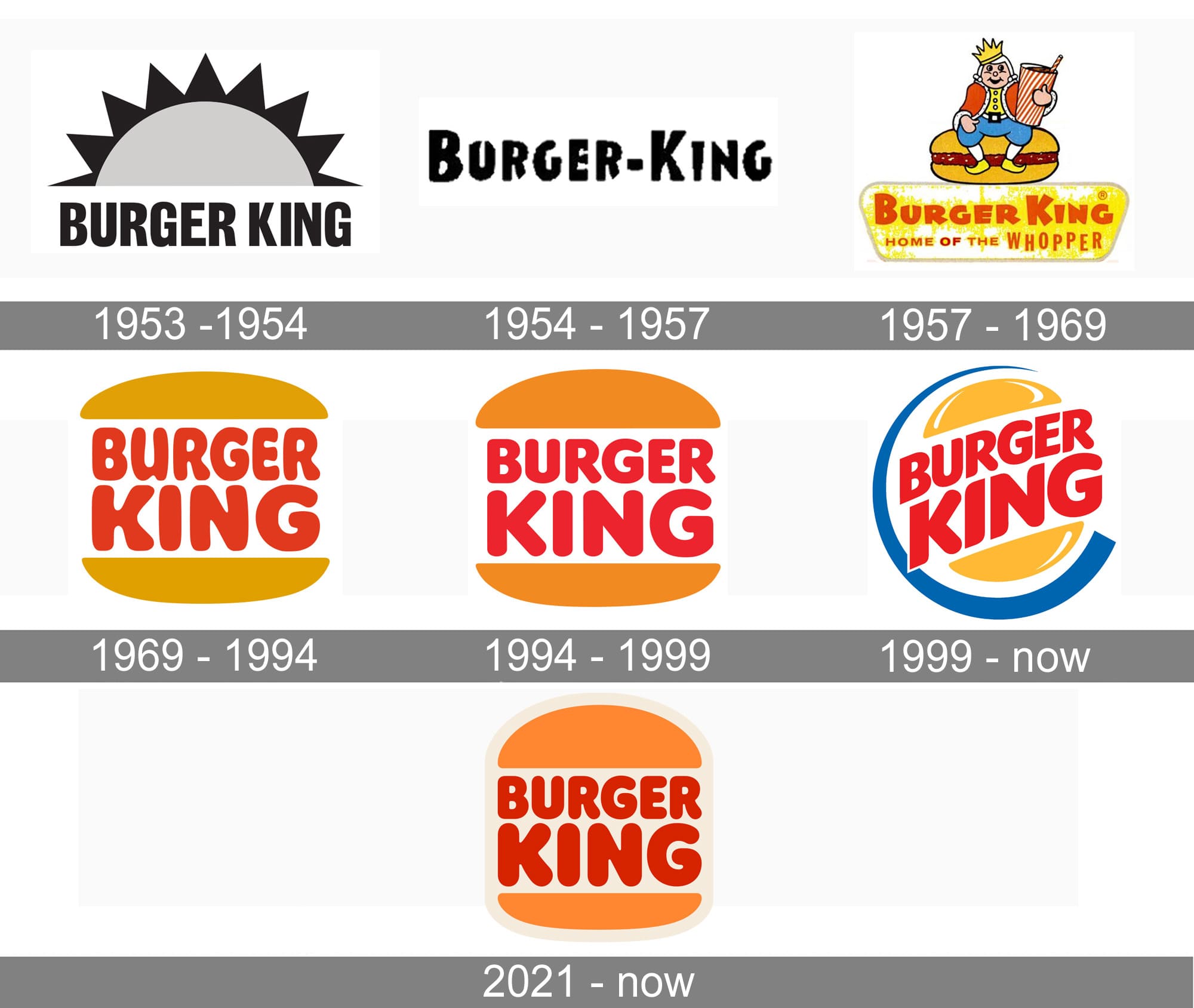
Source: 1000 Logos
Microsoft
The technology giant has always highlighted the brand name in their logo with variant additions and eliminations made over time. The first logo was monochrome in all caps made up of a series of individual lines, with some lines are bolder than others – that created a sense of motion and depth. The second is based on the New Zelek font – all aggressive and piercing diagonals. The third was the dialing back to the original logo – but a clean and simple version. The fourth was the longest-running- spanning two decades – assertive, not aggressive. The fifth logo saw the inclusion of four-color windows – connecting the logo to the brand.
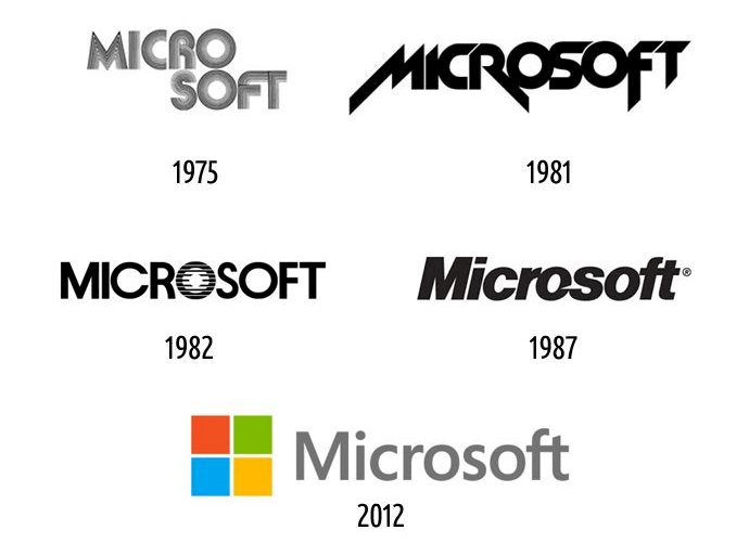
Source: LogoMyWay
Apple
Before the bitten apple was employed, Isaac Newton played the protagonist of Apple’s logo, sitting under an apple tree, and a quote from William Wordsworth, “Newton…. a mind forever voyaging through strange seas of thought.” It was too old-fashioned – Jobs believed, and hired graphic designer Rob Janoff, who then created the classic and world-renowned logo of the bitten apple. The original version contained a rainbow spectrum, a nod towards Apple’s computer Apple II which was the world’s first computer with a color display. The multi-colored logo was in use for 22 years before it was replaced by a modern monochromatic look. Since then the logo has undergone modifications and adjustments in terms of size and color, but the original shape and imagery remain the same.
![]()
Source: Logo Genie
McDonald’s
Thanks to Stanley Clark Meston, the designer of the first franchise unit, the Golden Arches became an integral part of McDonald’s. Before the Arches took the shape of the logo, the McDonald’s brothers designed the tempting ‘Barbeque’, ‘Hamburger’ and ‘Speedee Service’. After Ray Kroc bought the business, he redesigned the logo and changed it into a new design that resembles the arches of the restaurant facility. The two arches joined and birthed the ‘M’ model. The original version saw a line passing through it, the second saw the inclusion of the brand name, and the third became the most successful with the “i’m lovin’ it” campaign that also became the slogan of the company.
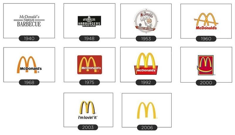
Source: Digital Doughnut